There is a garden you have almost certainly walked through, even if you cannot name it. The moment you enter, something shifts. The air feels different — not cooler, exactly, but more considered. A path draws you forward without announcing itself. Shadow falls across stone in a way that seems inevitable. Nothing is competing for your attention. Everything is simply there.
You do not know the budget. You cannot see the invoice. But you know, with a certainty that bypasses language, that this landscape was designed by someone who understood something fundamental about space.
The question worth asking is: what, precisely, did they understand?
The answer is not a materials list. It is not a plant palette or a construction specification. It is a design grammar — a set of principles so consistent across the finest landscapes in the world that they amount to something close to a language. And like any language, once you learn to read it, you cannot stop seeing it everywhere.
These principles have names: spatial hierarchy, negative space, proportion, grammar, restraint. Together, they account for almost everything that separates a landscape that feels expensive from one that, regardless of what was actually spent, does not.
Spatial Hierarchy — The Architecture Before the Planting
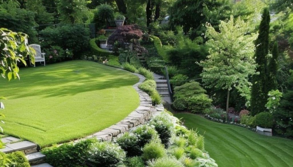
Every great landscape has a logic of movement. You do not wander through it; you are conducted. There is an arrival, a transition, a destination — and the journey between them has been calibrated so precisely that you experience each without being conscious of the design decisions that produced it.
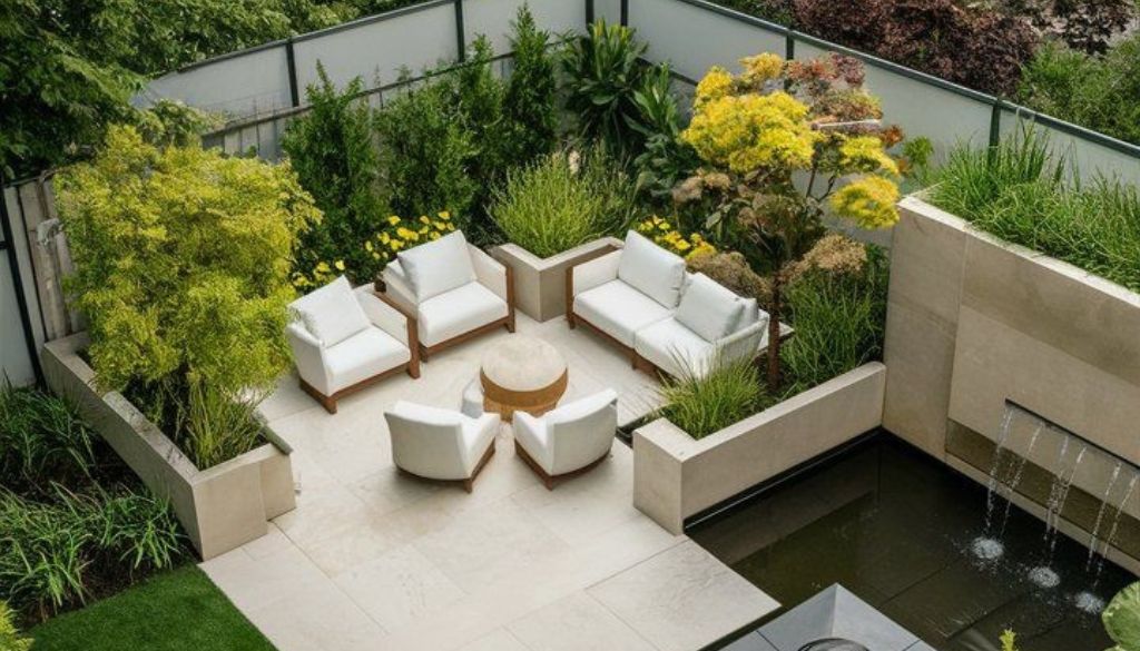
This is spatial hierarchy: the deliberate arrangement of spaces from dominant to subordinate, from the grand to the intimate. It is, in essence, the architecture of a landscape before a single plant has been chosen. And it is the first thing that distinguishes a designed exterior from an assembled one.
In ordinary gardens, everything is presented simultaneously. You step outside and the lawn, the beds, the terrace, the far fence — all of it arrives at once. There is no sequence, no withheld information, no moment of compression before release. The experience is complete and unremarkable in the same instant.
The Japanese concept of ma — the meaningful pause between elements — is one of the most powerful tools in considered landscape design, and if you want to understand how it translates into a complete garden framework, our guide on how to make a Japanese garden walks through the philosophy and structure in practical detail.
In premium landscapes, you are led. The arrival sequence might compress you through a narrow passage of clipped hedging before opening onto a broad terrace. A path might bend just enough to hide the garden’s full extent, so that turning the corner becomes a small revelation. The borrowed landscape — whatever lies beyond the boundary, a tree line, a ridgeline, a neighbour’s canopy — is framed and consciously incorporated rather than accidentally included.
This principle translates directly to residential scale, and it is often most powerful in compact spaces. The difference between a path that bisects a lawn and one that approaches a destination obliquely is not a matter of budget — it is a matter of knowing that the journey toward something is as important as the arrival. The best landscape designers think in sequences long before they think in species.
Negative Space — The Courage to Leave Things Empty
Of all the principles that distinguish premium landscape design, negative space is perhaps the most immediately legible — and the most difficult to sell.
Negative space in a landscape is exactly what it sounds like: the lawn left unplanted, the gravel expanse left uncluttered, the still sheet of water left unadorned, the raked stone left without ornament. It is not emptiness. It is purposeful silence. And it is one of the clearest markers of design confidence that exists.
The instinct to fill available space is almost universal. Homeowners look at a bare area and experience it as a problem awaiting a solution — another bed, another specimen, another structure. This impulse is understandable, even sympathetic. It usually comes from a genuine enthusiasm for plants, from wanting to feel that value has been extracted from every square metre, from the anxiety of incompleteness.
But the effect of filling every available space is the same regardless of what fills it: visual noise. The eye has nowhere to rest. The plants compete for attention. The space reads as small, because density and scale are inversely related — the more you put in, the less room the garden appears to have.
Japanese design has a name for the interval of purposeful emptiness: ma. It refers not simply to physical space but to the meaningful pause — the silence between notes that gives the music its shape. Translated into landscape, it is the void that makes the planted element land with weight, the open ground that allows a specimen tree to be experienced as a specimen rather than one object among many.
There is also a specifically Australian dimension to this principle. The native landscape vernacular — the sun-bleached expanse, the wide interval between trees, the dry ground punctuated by isolated form — is not a limitation to be overcome. It is a design language in itself. Contemporary Australian landscape architects who lean into this quality, who allow their gardens to breathe in the way the broader landscape does, are drawing on one of the most powerful aesthetic resources available to them. The temptation to import a denser, greener, more European sensibility often produces gardens that look as though they are trying too hard in a climate that rewards ease.
The gardens that age best in Australia are almost always the ones that understood what to leave out.
Proportion — The Silent Rule That Governs Everything
Proportion is not a formula. The golden ratio is a useful reference point and a reasonable starting intuition, but the designer who reaches for a calculator before making a spatial decision has already missed the point. Proportion is felt before it is calculated. It is a sensitivity — developed through practice, observation, and the disciplined study of spaces that work — rather than a rule applied from outside.
What proportion means in practical terms is the relationship between elements: height to width in a clipped hedge, the ratio of paving to planting to open ground, the scale of a piece of furniture relative to the terrace it inhabits. Premium landscapes are characterised not by any single correct ratio but by a consistency of relationship across every element — a coherence that the eye registers as harmony even when it cannot articulate why.
The most important proportional relationship in residential landscape design is probably the simplest: the ratio of hard surface to soft planting to open void. Landscapes that allocate too much area to paving feel arid and corporate. Those that fill every bed to capacity feel chaotic and difficult to maintain. The gardens that feel genuinely expensive tend to resist dominance by any single category — hard, soft, and void are in genuine conversation with each other, each providing relief from the others.
There is also the question of human scale. The finest landscapes are calibrated to the person moving through them, not to the site plan viewed from above. A path that looks generous on paper may feel cramped in practice if it does not allow two people to walk side by side. A terrace that appears well-proportioned in plan may feel exposed and uncomfortable at ground level if the enclosing elements are too low to provide any sense of definition.
Common proportion errors are worth naming because they are so consistent. Oversized outdoor furniture on undersized terraces is perhaps the most prevalent — the pieces that fill a showroom with drama reduce a modest terrace to a storage problem. Hedges cropped below eye level lose their enclosing quality and exist as low-level clutter rather than spatial definition. Paths narrowed below a metre feel provisional, not quite committed. Getting proportion right does not require a large budget. It requires looking carefully at a space as it is lived in, not as it is drawn.
Getting the balance of hard surface, soft planting, and open void right is one of the most important spatial decisions you will make — for practical inspiration on how these proportions play out in real Melbourne backyards, see our collection of backyard landscaping ideas that demonstrate these principles across a range of spaces and budgets.
Symmetry vs Asymmetry
Symmetry and asymmetry are not opposites in terms of quality. Neither is inherently more luxurious. What matters is not which grammar you choose, but whether you choose deliberately — and whether you hold to that choice across every element of the design.
Symmetry is the language of formality. It signals permanence, authority, and a certain classicism. It asks the person experiencing it to stop, to look, to be presented with something. The great formal gardens of Europe — their clipped allées, their mirrored parterres, their bilateral axes — are exercises in symmetry understood as a kind of argument: this is a landscape that has been imposed on nature, that declares its intentions clearly and holds them with absolute confidence.
Asymmetry speaks differently. It is the language of flow, of naturalness, of contemporary ease. Japanese gardens, Scandinavian landscapes, the New Wave Naturalistic planting movement — all operate in asymmetric grammar. They ask the person moving through them to participate, to discover, to follow a logic that feels organic even when it is, in fact, precisely designed.
Layouts that are neither deliberately formal nor deliberately relaxed read as unresolved. A near-symmetrical terrace with a casually asymmetric planting scheme produces a cognitive dissonance that the observer experiences as vague dissatisfaction without being able to name its source.
If you are still exploring which design register feels right for your property, our breakdown of garden design styles suited to every home covers the full spectrum from formal European layouts to relaxed native cottage approaches, helping you identify the grammar that aligns with both your architecture and your lifestyle.
The most reliable guide to choosing between them is the architecture. Read the building before you read the garden. A Georgian terrace has symmetry written into its bones. Responding to that with a loose, flowing landscape creates a conversation between two languages that never quite resolve. A contemporary pavilion with a single dominant axis might be precisely the right frame for a landscape that declines to complete the symmetry and instead flows away from it. The garden and the building should share a grammatical register. When they do, even a modest landscape feels considered. When they do not, no amount of expensive planting will make it feel right.
Restraint — The Hardest, Most Expensive-Looking Discipline
Everything discussed so far — hierarchy, negative space, proportion, grammar — is, in the end, a form of restraint. But restraint as a principle in its own right refers most specifically to the palette: the discipline of working with fewer species, fewer materials, fewer colours, and executing each with exceptional depth and consistency.
Premium landscapes typically use a narrowly defined plant palette repeated with confidence across the full extent of the design. Three or four structural species, perhaps a handful of supporting plants, held throughout and allowed to mature into genuine presence. The temptation — and it is nearly universal — is to introduce variety: to add the specimen that caught the eye at the nursery, to accept the client’s request for one more element outside the original palette. Each individual addition might be defensible. The cumulative effect is always dilution.
The principle of repetition as intention is worth dwelling on. A single specimen olive tree in a garden is a purchase. A grove of five olives, precisely spaced, is a design decision — it has scale, it creates enclosure, it reads as considered rather than acquired. The difference in effect is disproportionate to the difference in cost. Repetition is the single most efficient tool a landscape designer has for elevating a space.
The same principle applies to materials. Premium landscapes are characterised by a commitment to one stone, one timber, one metal finish — and a refusal to introduce alternatives without reason. When three or four different materials appear across a small garden, the eye reads disunity before it reads any individual element.
There is also a temporal dimension to restraint. Gardens designed for quiet dignity through dormant months — through the grey of a cool-climate winter, through the dry heat of an Australian summer — age better than those designed around a peak-bloom moment. A landscape built on strong structure, clipped form, and textural contrast will hold its quality across every season.
The hardest part of the restraint conversation is the client relationship. Most people, looking at a design that holds back, feel a concern that is not quite cost-related — a worry that the garden will look unfinished, that they are not getting enough. The designer’s task is to hold confidence in a vision that will only fully reveal itself at year three, year five, year ten. The ones that hold the longest tend to be the ones where someone, at some point, said no.
Restraint and repetition are not isolated instincts — they sit within a broader set of design principles that govern balance, focalization, and unity across an entire landscape, all of which are covered in detail in our guide to the general elements and principles of landscape design and worth reading alongside this piece.
Reading a Landscape Like a Designer
These five principles are not a checklist. They are a framework for attention — a way of developing the sensitivity to space that separates a designed landscape from an assembled one.
Before any design decision is made, it is worth asking five questions about the site as it exists. Where does the sequence lead, and is there a sequence at all? Where is the void, and is it purposeful or accidental? Do the proportional relationships feel calibrated, or have they been arrived at by default? Does the spatial grammar align with the architecture? And what, precisely, could be removed without the design suffering?
The last question is the most important and the least natural. Design culture — including the culture of lifestyle media, of curated feeds, of platforms built around visual accumulation — rewards the act of adding. The discipline of the exceptional garden is almost always the discipline of editing.
This is why working with a designer fluent in these principles changes the outcome more fundamentally than any single plant or material selection. The species list and the material schedule are outputs of the design process. The design process itself is a way of seeing — a trained attention to spatial relationships that determines whether a landscape reads as resolved or unfinished, considered or accumulated, expensive or merely costly.
The distinction matters because it is durable. Trends in planting, in materials, in garden typology, cycle through. The underlying grammar of great landscape does not.
If these five questions feel like a significant shift from where you are currently starting, our beginner’s guide to landscaping provides a grounded introduction to planning, plant selection, and the foundational decisions that set any garden up for long-term success.
There is still that garden. You are still standing in it. The path curves ahead, unhurried. Shadow moves across stone with the slow confidence of something that has been here a long time. Nothing announces itself. Nothing asks to be admired.
You do not know the budget. You do not need to.
You know, with the certainty that good design always produces, that whoever made this understood the language — and had the discipline, and the courage, to speak it quietly.
Frequently Asked Questions
What makes a garden look expensive without spending more money?
The qualities that read as expensive — negative space, a restrained plant palette, strong spatial sequence, material consistency — are design decisions, not budget items. A garden with three species repeated confidently across a well-proportioned layout will almost always outperform a more costly one assembled without a coherent design logic.
What is spatial hierarchy in landscape design?
Spatial hierarchy is the deliberate organisation of a garden into a sequence of spaces — arrival, transition, destination — rather than presenting everything at once. It is the difference between a garden you are led through and one you simply stand in. It is one of the first things a trained designer establishes before any planting or material decisions are made.
How do I use negative space in my garden?
Start by resisting the instinct to fill. Identify areas of your garden that could function as purposeful open ground — a clear lawn panel, a simple gravel expanse, a clipped plane of a single species — and protect them from the accumulation of objects, ornaments, and additional planting. The void is doing work. Let it.
Should my garden be formal or informal?
Read your architecture first. A symmetrical, classically proportioned building will sit most comfortably with a landscape that shares that grammar. A contemporary, asymmetric structure can carry a looser, more naturalistic approach. The problem is rarely the style chosen — it is choosing no style, or mixing registers without intention.
How many plants should I use in a luxury landscape design?
Far fewer than you think. Premium landscape designers typically work with a structural palette of three to five species repeated throughout the site, supplemented by a small number of supporting plants. Breadth of species reads as variety at best and confusion at worst. Depth — the same plant in quantity, given space to mature — reads as design.
Ready to Design a Garden That Speaks for Itself?
At John French Landscape Design, we design gardens around principles, not trends — spaces that feel considered from the first visit and improve with every year that passes.
If you are ready to work with a designer who understands the language of luxury landscape, we would love to hear about your project.